We have been told since kindergarten. “Don’t judge a book by its cover.” It is a noble sentiment regarding human character, but in the brutal, high-speed marketplace of Amazon KDP and online book sales, it is terrible advice.
The reality is that everyone judges a book by its cover.
In the digital age, your book cover is not just a protective wrapper. It is a billboard, a movie trailer, and a psychological trigger all rolled into one JPEG. It has a job to do, and it has to do it in less than a second. If it fails, the potential reader scrolls past, and your story remains unread.
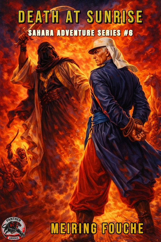
Over the last few months, I have undertaken a massive project. Creating 40 brand-new covers for the legendary Sahara Adventure series by Meiring Fouché. This journey forced me to deconstruct exactly what makes a cover work, physically, psychologically, and technically.
I moved from older AI models to the cutting edge of generative image technology, combining it with rigorous prompts to tell the story of Teuns Stegmann and his Foreign Legion crusades together with his four best friends in the Legion.
Here is the deep dive into the art, the science, and the madness of trying to create the perfect pulp fiction cover.
Part 1: The Psychology of the Split-Second
Before we touch a single pixel or write a single prompt, we have to understand the brain of the buyer. When a reader is browsing Amazon, they are in a state of rapid information processing. They are scanning hundreds of images. They are not reading. They are reacting.
The “Blink” Test
Does the reader understand the genre in a split second? This is the most critical metric.
If I am selling a pulp fiction action-adventure set in the post-WWII era, the cover cannot look like a modern technothriller or a cozy mystery. It needs to scream its identity.
Cognitive Ease: The human brain loves patterns. If a fan of classic “Men’s Adventure” fiction sees a cover that follows the visual language they love (grit, oil painting style, action), their brain releases a tiny hit of dopamine. They feel “at home.” They recognize the tropes immediately.
The Promise: The cover makes a contract with the reader. For my Meiring Fouché books, the cover promises: “Inside this book, there is heat, there is danger, there are enemies, and there is revenge.” If the cover is ambiguous, the reader feels subconscious friction and moves on.
Emotional Resonance
Does the cover trigger a feeling?
Great covers bypass logic and hit the gut. For the Sahara Adventure series, I didn’t just want “soldiers standing around.” I wanted the feeling of desperation and determination.
The Vibe: It’s not just about showing a gun. It’s about the sweat on the brow, the dust in the air, and the harshness of the sun. The “atmosphere” is what sells the emotion. The reader needs to feel thirsty just looking at the image.
Mirror Neurons: When we see a character on a cover looking exhausted but fierce, our mirror neurons fire. We briefly simulate that feeling. If the reader feels the grit of the desert sand just by looking at the thumbnail, I have won.
Part 2: The Physics of Design
Once the psychological goal is set, we have to execute it using the physical tools of design. This is where art meets geometry and where historical aesthetics collide with modern marketing.
1. Color Theory and The Uniform
Color is the loudest voice in the room. For the Sahara Adventure series, I made a very specific stylistic choice regarding the uniforms.
History buffs will know that by the late 1940s, the Legion was largely wearing khaki fatigues. However, “Pulp Fiction” is not a documentary, it is a heightened reality. I wanted the iconic look, the romanticized version of the Legion that lives in the popular imagination.
Therefore, my color palette was strictly controlled:
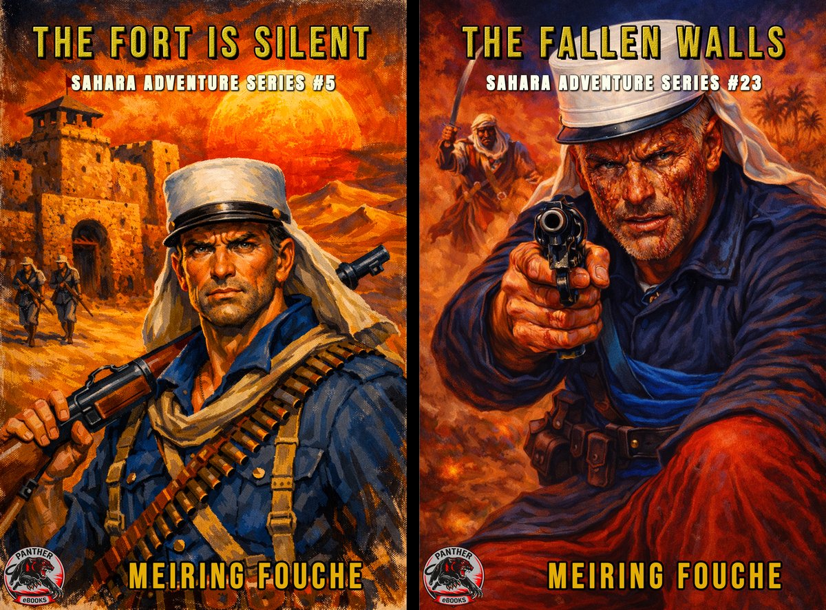
The Uniform Palette: I prompted the AI specifically for the classic 19th and early 20th-century dress: The White Kepi (symbolizing the Legion), The Blue Tunic/Jacket, The Red Trousers, and The Blue Sash.
Contrast: This creates a striking visual contrast. The cool blues and bright reds of the uniform pop violently against the scorched ochres and burning oranges of the desert sand.
Saturation: Pulp fiction is not subtle. The colors need to be high-contrast and saturated. The shadows are deep black, and the highlights are blinding white. This mimics the harsh lighting of the African desert.
2. Typography and Fonts
The font is not just text, it is an image in itself.
Size Matters: In the thumbnail era, the title must be legible at 100 pixels wide. I opted for massive, blocky, sans-serif fonts that scream “ACTION.”
Texture: A clean, digital font looks wrong on a pulp cover. The text needs to look weathered, perhaps slightly distressed, as if it has been sitting in a soldier’s rucksack for a month.
Placement: The text serves as the “roof” and the “floor” of the image. It frames the artwork.
3. The Camera Lens: Zoom In vs. Zoom Out
This is a debate I had with myself constantly during the creation of the 40 covers.
The Zoom In (The Character Study):
Pros: Focuses on emotion. You see the scar on the cheek, the intensity in the eyes. It creates a connection with the hero.
Cons: You lose the sense of scale. It could be happening anywhere.
The Zoom Out (The Landscape):
Pros: Establishes the setting. The vast, unforgiving dunes of the Sahara. The tiny silhouette of a Legionnaire against a massive fort. This emphasizes the theme of “Man vs. Nature.”
Cons: The character becomes anonymous.
The Verdict: For this series, I used a mixture. However, I found that “Medium Shots” (waist up) often worked best to show off that distinctive Blue Tunic and Red Trousers uniform while still allowing enough background to show the endless desert.
4. Layout and Negative Space
A rookie mistake is filling every inch of the canvas with noise.
Breathing Room: You need negative space (usually the sky or a dark shadow) where the title and author name can sit without fighting the illustration.
Hierarchy: The eye should travel in a specific path. Usually: Title then The White Kepi then The Weapon then Author Name.
Part 3: The Tools of Creation (AI vs. Photography)
There is a misconception that AI art is “instant.” People assume you push a button, and a masterpiece falls out.
This is false.
Creating professional-grade book covers with AI is a labor-intensive workflow that, in my experience, can take way longer than snapping a stock photo because of the “Tugging of War” you play with the software.
The Challenge of Consistency
One of the biggest hurdles I faced was Teuns Stegmann himself.
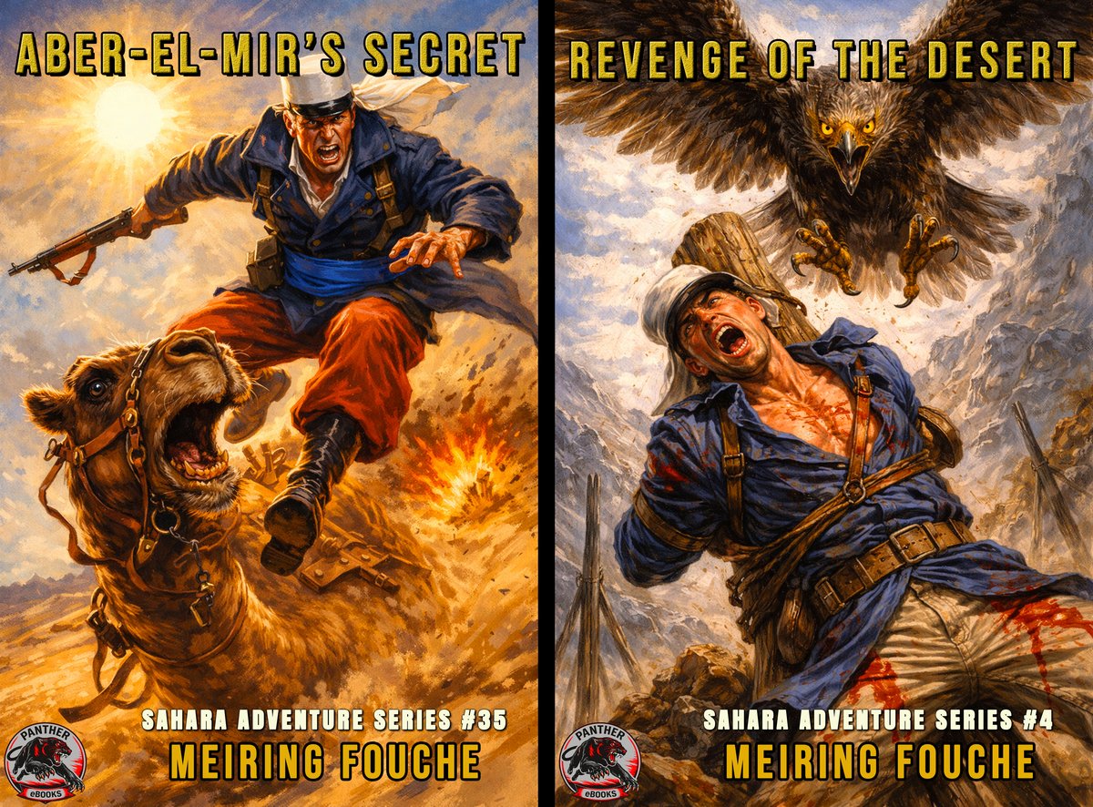
Ideally, you want the main character to look exactly the same in Book 1 as he does in Book 40. I spent days trying to train the AI to replicate the exact same facial structure, scar placement, and eye color for every single cover.
The Reality: It was too complicated and too time-intensive. The AI models are stubborn. They would give me the perfect face but the wrong uniform, or the perfect uniform but a distorted face.
The Solution: I had to let go of perfection. I decided that the uniform (White Kepi, Blue Jacket, Red Trousers) and the general build (rugged, broad-shouldered) were enough to identify him as Teuns. The readers are there for the adventure, not a biometric face scan.
★ Sluit Aan by Panther Ebooks op Substack ★
Ontvang eksklusiewe nuwe hoofstukke, agter-die-skerms navorsing en gratis e-boeke direk in jou e-pos.
Sluit Gratis Aan op Substack →The AI Workflow
For the 40 Sahara Adventure books, I used the latest generation of AI software. Here is what the actual process looks like:
Phase 1: Research & Prompt Construction
I had to feed the AI very specific instructions to get that classic look. I couldn’t just say “soldier.” The prompt had to be precise about the clothing. Here is an example:
“1940s pulp magazine art style, oil painting texture, aggressive brushstrokes. A rugged South African Legionnaire, Teuns Stegmann, wearing a white Kepi Blanc, deep blue military tunic with gold buttons, bright red trousers, and a blue sash. Standing in the dunes of the Sahara. Intense midday sun, harsh shadows. In the background, a German Messerschmitt crash site. Masterpiece, volumetric lighting.”
Phase 2: Generation and Iteration (The Hallucination Phase)
First, I generate hundreds of images to find good ones for the series.
Historical Drift: AI struggles with specific historical objects. It might try to give the soldier a modern M16 rifle instead of a bolt-action rifle. Or it might make the plane look like a spaceship.
Vibe over Facts: I realized early on that I had to prioritize the Vibe over 100% historical accuracy. Does it look cool? Does it feel like an adventure? Yes? Then I keep it. If I obsessed over the exact model of the canteen on his belt, I would never finish. The AI is an artist, not a historian, and sometimes you have to let it go, let it paint and accept the flaws.
Phase 3: Curation and Upscaling
Out of the hundreds of generations, I picked the top forty, once again with the help of AI guidance. Then I scrutinized them. Does the Blue Tunic look right against the sand? Is the composition dynamic?
Once I picked my 40 best covers, I used AI upscalers to make the image print-quality sharp without losing the “painted” texture.
Phase 4: The Human Touch (Editing)
The AI gets me 90% of the way there. The last 10% is manual labor in Photoshop to fix the small imperfections like a floating button, a weirdly shaped hand, or color-grading the red trousers to ensure they match across all 40 covers. This process alone took many days of work and the end results still had imperfections that Photoshop could not fix.
Part 4: The Case Study - Meiring Fouché & Teuns Stegmann
Why go to all this trouble? Because these stories deserve it.
The Sahara Adventure series is unique in the world of fiction. Written by the renowned South African author Meiring Fouché (and Pieter Haasbroek that brought it back to today’s readers), these are not generic war stories. They have a specific soul.
The Background
The protagonist is Teuns Stegmann. He is not a career soldier by choice. He is a man driven by loss.
Teuns was a wine farmer in the beautiful Hex River Valley of South Africa. He had land, he had peace, and he had a future. But World War II shattered all of that.
His brother, a fighter pilot, was shot down over the North African desert by a German ace. The official report said “Missing in Action,” but Teuns refused to believe his brother was dead.
Driven by a need for revenge against the German pilot and a desperate hope to find his brother alive in the vast wasteland, Teuns left his farm, travelled north and joined the French Foreign Legion.
This backstory is the heartbeat of the series. It’s about brotherhood, vengeance, and the contrast between the lush Hex Valley and the barren Sahara.
A Global Undertaking
This project is bigger than just new covers.
Currently, all 40 ebooks are available on Amazon in both English and Afrikaans.
But the story of Teuns Stegmann is a universal one. The themes of revenge and survival transcend borders. Therefore, I am excited to announce that I am planning a massive undertaking by also translating the entire series into French, German, Italian, and Spanish.
Teuns Stegmann is going global in the near future!
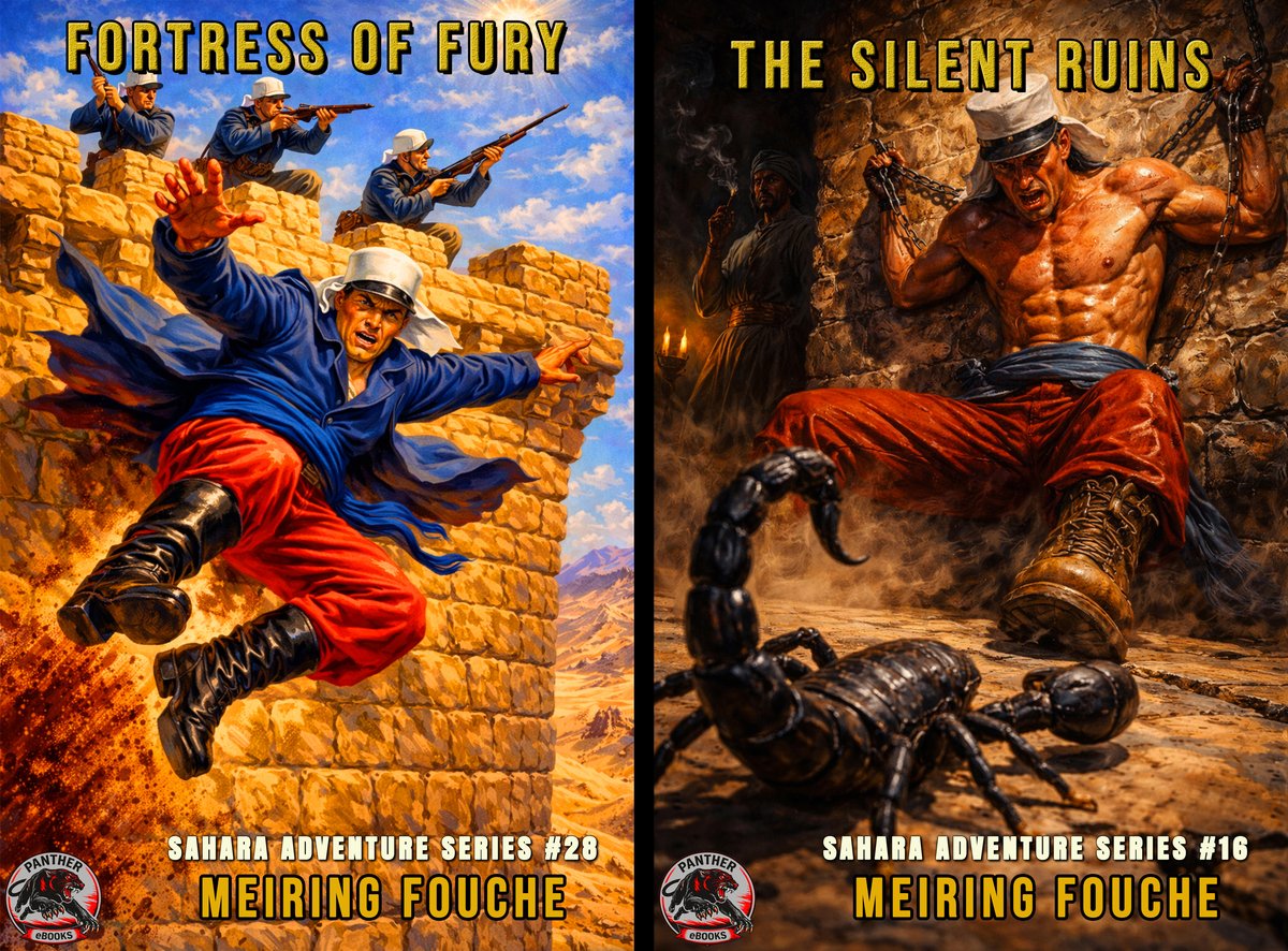
Part 5: The Showcase
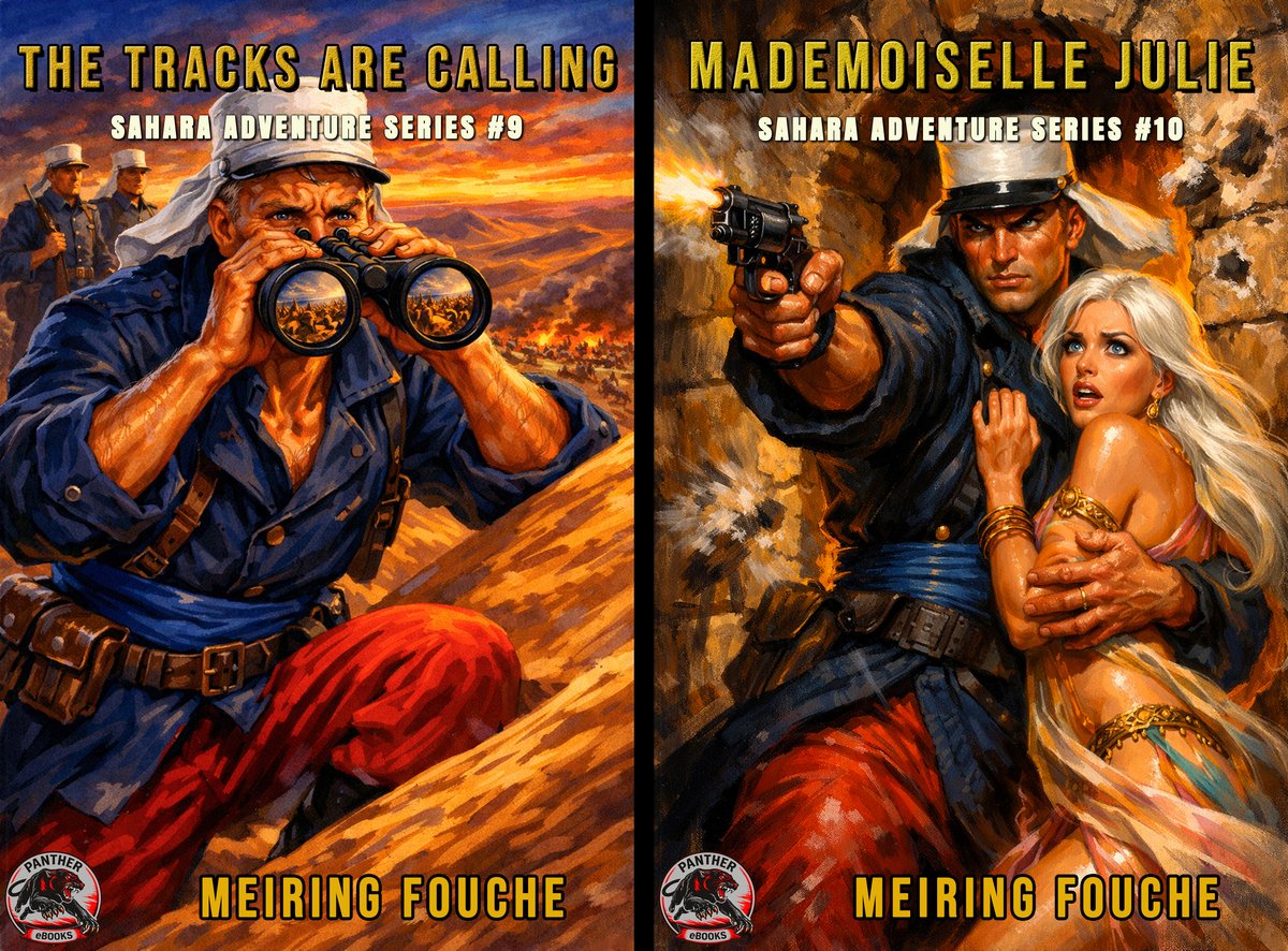
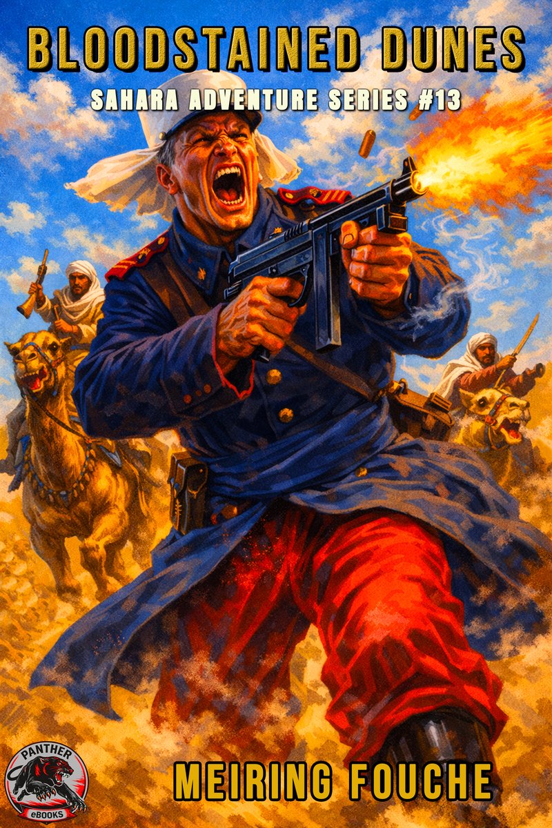
I am incredibly proud of this collection. Look more closely at the covers you have seen thus far, that is part of the 40 books in the series. You will notice how the physical and psychological elements we discussed have come together.
(Note the prominent use of the Blue Tunic/Red Trouser combination to create a focal point against the yellow sand.)
Part 6: Bringing it to Life (The Video)
Static images are great, but to truly sell the “Pulp” vibe, you need motion.
I wanted to evoke the feeling of a Saturday matinee movie from the 1980s. The kind you’d rent on VHS. I took all 40 of these new covers and compiled them into a video trailer. I added film grain, tracking errors, and a synth-heavy soundtrack to really drive home the nostalgia.
Watch the full collection of the new Sahara Adventure covers here:
Above video show the 40 Covers of the Sahara Adventure Series – 1980s VHS Style.
Conclusion: The Eye of the Beholder
We have discussed the science, the psychology, the geometry, and the technology. We have spent hundreds of hours crafting the perfect prompt and tweaking the kerning on the font.
But I must end with a hard dose of reality.
Beauty is in the eye of the beholder.
You can follow every rule of design. You can use the most advanced AI. You can have perfect color theory. And yet, a potential reader might look at your cover and feel... nothing.
What I consider a masterpiece of pulp art, another person might see as “messy or AI slop.” What I see as a “dynamic action pose,” a reader might see as “cluttered.”
There is no mathematical formula for a best-seller. The market is a living, breathing, unpredictable beast. A cover that flops today might have been a hit ten years ago, or vice versa.
However, as authors and publishers, we cannot let that paralyze us. We control what we can control. We ensure the Physics are sound. We ensure the Psychology is targeted. We use the best Tools available to us.
By rebranding the Sahara Adventure series, I have done my best to honor the legacy of Meiring Fouché and the story of Teuns Stegmann. I have dressed these stories in the finest suit I can tailor, or rather, the finest Blue Tunic and White Kepi. Now, I must step back and let the readers decide if they want to read these magnificent stories or not, by judging the covers.
If you are interested in seeing if these covers match the stories, or if you just want to experience a classic adventure of revenge and survival, you can find these books on Amazon, Google Play, Kobo and many other online shops and libraries.
Search on Amazon for: “Meiring Fouché and Pieter Haasbroek Sahara Adventure Series”
Read the summaries. Look at the covers. Judge them. That is, after all, exactly what I designed them for.
Or find the full series on my Amazon Author page in the link below.
★ Sluit Aan by Panther Ebooks op Substack ★
Ontvang eksklusiewe nuwe hoofstukke, agter-die-skerms navorsing en gratis e-boeke direk in jou e-pos.
Sluit Gratis Aan op Substack →Panther Ebooks
Bringing the Golden Age of Adventure back to life.
Copyright © 2026 Panther Ebooks. All rights reserved.